GrabHealth, Good Doctor Tecnology
UI Case study
How do you envision the product to scale visually in the next 3 years?

Goals
As Good Doctor Technology is already 1 year old, it is time for the design team to come out with future outlook on how our app will look and feel in the years to come. The team will come out with most scalable and viable ideas on how the app will serve our users to give the best experience with the latest user friendly interfaces.

Icons


Our New Icons
After several researches, I’ve found the best way to convert available 2D resources so that it’s easier for next designer’s handover.


Past and other methods require you to adjust every colour value in effects.
Now you only need to copy my properties and adjust fill colour for all icons.
Went through several iterations from my researches and selected the one closest to Big Sur icon.
Application and usage
Using the icons as a base and other references on the upcoming UIUX solutions in the community, I’ve created a new design concept with new colour schemes and layout on our existing verticals
Verticals

Homepage
Changing the pink bg we used currently to white with light greyish container for most of the essential informations, the whole app looks much cleaner and refreshing at the same time with the new 3D icons used for all verticals.
Shadows, although looks nice, has also been reduced as it makes UIs seems blurry at times. It’s also often inconsistent in our current app.

The new bottom tab bar
Before and after, w/o marketing banner but with insurance benefits widget

Activities
The page has been retouched using the new design system. Activities card has been slightly adjusted for better visibility on activitiy important statuses.
Eg. Payment pending, ongoing consultation, etc.

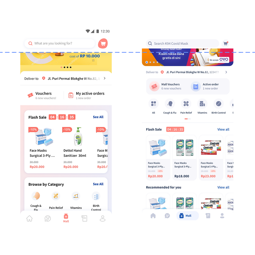
Mall
To keep it consistent with consult, the top banner is used but sizing has been adjusted to make it smaller than the current app so that users can view more products in the screen.
Categories has also been reduced to speed up user’s glance on any relevant medicines to buy.

Simple icons to reduce distractions from the large amount of products

Simple flat colours can be used too to differentiate. This simple design scheme ease the work on designers.
Effort is spent more on the important 3D icons which is rarely added during common sprints


Typography
Stick with the original font that we have to not overcomplicated the change.

Wellness
As wellness is becoming our main focus right now, its good for it to have an individual page and make use of a secondary bottom tab bar to replace the primary tab bar that we use in the home page. This is to give user better access on all the wellness or health retention type of programmes for all the users that are health conscious.
Articles
I personally feel that for the healthcare industry, article deserves a greater importance to highlight issues and self care.
To better facilitate this, ‘Activities’ page has been swapped with Article as in the above mentioned, you can also access ‘Activities’ from the ‘Profile page.’


Styleguide

It all started with the icons...
Apple OS, Big Sur and iOS using 3D icons set the standard for being the most updated in design community. With 3D icons being eyecatching and photorealistic, I’ve decided to adopt this design format and convert our icons to 3D format.
Apple Big Sur Icons

Sample CTA application
Colours
By not using solid black, the whole UI will look not so striking due to the contrast.
I’ve also added a new CTA blue as it blends better with the modern UI look and trend. The original blue is also used throughout but kept to the minimum together with Good Doctor Pink.
This is to ensure more clarity on our colour content and UI interfaces won’t compete with the use of more neutral colour like the new black and grey.

New CTA blue, black and grey
Possibilities

Consult
Reduced the sizes of the categories card for better white spaces around the screen. Added voucher with the start consult side by side. Layout wise personally feel that it can be further improved. Also added an optional top banner section to better collaborate with the marketing team for all kinds or promotions

Profile
Profile has gone through the most changes. Other than the addition of new user verification segment, I’ve also added an activities bar where you can see activities at a glance. With this feature, we can also replace ‘Activities’ page with another verticle which i’ll talk more about it later.
Other notable elements
Top nav bar also been reduced during scrolling to expose more of the rich content below. Search bar is also reduced using the current popular commerce app sizing.
Search content writing is also updated with a better relevance to the verticles.
Global address placement and styling also has been aligned with consult and homepage to keep the consistency.
Global address in consult and mall
