Syfe
Rebranding of Syfe Mobile Application
Onwards to profitability and Series C

Introduction
Syfe is a comprehensive investment platform offering services across Managed Portfolio, Brokerage, and Cash Management verticals. Users can add funds to their portfolios or brokerage wallets, monitor their investment performance, and receive tailored investment suggestions based on market conditions.

The application, reaching its five-year mark, faced challenges with outdated user experience and visuals. With several upcoming initiatives and a funding exercise, the decision was made to rebrand the app, providing users with a brand-new, refreshing experience that aligns with the latest website brand revamp.

Before and after

Particularly between the Brokerage system (first screen, launched two years ago) and the Managed Portfolio and Cash Management systems (second screen, launched five years ago). They look significantly different.
Identifying the Need for Rebranding
Broken Experience
The Syfe mobile application, over the years, developed a series of legacy flows and design inconsistencies. The lack of a unified design system led to a broken user experience and a fragmented look and feel across different verticals.
As Syfe aimed to align its mobile app with the new website branding initiated in May 2023, a comprehensive rebrand was necessary to improve user experience, maintain consistency, and update the app’s visuals to meet modern design standards.

Earlier significant achievement during the onboarding rebranding in March 2024 was the reduction of onboarding steps by 60%, leading to a 15% improvement in user conversion rates since the unified onboarding process was launched.
With this in mind, the primary goals of the rebranding were to enhance the user experience, create a consistent look and feel from onboarding and across all verticals, and align the mobile app with the newly revamped website. By doing so, Syfe aimed to increase cross-investment across verticals, particularly encouraging users focused on one vertical (e.g., Cash Management) to explore others (e.g., Brokerage). Additionally, the project sought to improve overall Assets Under Management (AUM) and profitability, especially through increased Brokerage transactions.
Defining the Objective
1
Consistent look and feel across verticals
3
Improve AUM and profits with improved experience
2
Increase cross-investment
Understanding the Target Audience
Primarily targets users with an annual income exceeding SGD 120,000, offering them premium investment services across our offerings. The design aimed to reflect a premium look and feel, consistent with the expectations of high-income users.
For the Cash Management products, with its low risk, easy to understand returns, the general public was also considered as a target audience.

Regional Offerings
In terms of regional offerings, Singapore features all three verticals, while Hong Kong focuses on Managed Portfolio and Cash Management, and Australia offers services in cryptocurrency, as well as US and AU market stocks and securities. The design carefully balanced these regional differences to ensure a consistent yet localized user experience.


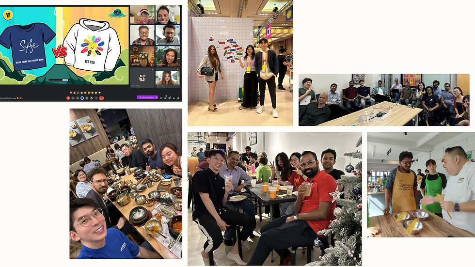
Workshops, screen mapping and alignment with the help of my fellow designers and design manager.

Showcasing stakeholder management during extensive Brokerage Rebrand design review with CPO, CMO, CEO, Head of Design, PM and Design Ops Manager.

Final alignment with CBO, CMO, Head of Brand, PM and Design Ops Manager before Managed Portfolio and Cash Management rollout.
The screen mapping exercise revealed which modules needed a complete redesign versus a reskin. The redesign focused on enhancing user experience based on previous user feedback and data analytics. The reskin involved just applying the new brand design system.
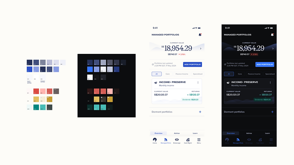
Collaboration was key in this phase, with the design team working closely with QA engineers and other stakeholders. The project timeline was carefully planned, with responsibilities clearly defined. The design system, initially created for unified onboarding and the website revamp, was scaled to support this app rebranding project. Me as the Principal Product Designer led the primary design effort, focusing on 70% of the modules, especially those undergoing a redesign.
This or that

Brokerage home and stock details were one of the selected flow as a revamp module, major overhaul.
Implementation & Prototyping
Concept screens, explorations, and prototypes were developed and went through seven rounds of internal feedback and validation. The design system ensured consistency across the app, and the prototypes were aligned with the brand department to reflect the new brand direction and strategy.
User interviews were conducted with approximately 15-20 active users, resulting in a 90% approval rate for the new designs and user experience. This feedback was instrumental in refining the final design.
![syfe 9].png](https://static.wixstatic.com/media/f46927_130679e804bd42bba8d55d967e3bd308~mv2.png/v1/fill/w_980,h_865,al_c,q_90,usm_0.66_1.00_0.01,enc_avif,quality_auto/syfe%209%5D.png)
The design system created for the unified onboarding process and website revamp was adapted and scaled for the mobile app post onboarding rebranding.
15-20
users interviewed
90%
approval rate

User interview and validation in progress
During the session, we found out that dark mode is highly sought for by the users, I have initiated this with fellow PM, a delightful feature work in progress
The project timeline was executed over eight months, with the Brokerage designs completed first. The rollout in Singapore was conducted in phases: 5% of users in the first week, 10% in the second week, to monitor for technical issues.
Feedback was gathered from the customer service team and App Store reviews, leading to improvements in key features like the performance page in Brokerage and adjustments to font sizing and contrast. User validation was conducted with the first 10% of brokerage only users, and the learnings were applied to the Managed Portfolio and Cash Management verticals. These were launched in July, following the same phased rollout process, which resulted in reduced negative feedback and a successful rebranding.
Project Execution and Phased Rollout
~8 months
Timeline
5%
rollout in the first week, 10% consequently in the second week and then full rollout.
15+
designers, developers and PMs involved
Design process
These are some other preparations I did during the discovery followed by define phase:
-
Screen Mapping
-
Mapped all app screens and user flows across the three verticals in a single Figma file.
-
Collaborated with QA and conducted extensive research into legacy Sketch design files.
-
-
Workshop
-
Conducted with the design director and fellow designers.
-
Rethought the sitemap, information architecture (IA), and product strategy.
-
Focused on cross-selling opportunities without cannibalizing other verticals.
-
-
Alignment:
-
Aligned with senior management and product owners from all three verticals.
-
-
Outcome:
-
Created a clear roadmap of which modules would undergo a complete user experience revamp rethink and which would be reskinned.
-

The rebranding process referenced the double diamond design thinking model, starting with a thorough discovery phase as mentioned above.

Leading the conversation on design processes with the designers to improve on efficiency and communication.

Discussing with P+D as the lead and explaining design decisions before showcasing the iterations to the stakeholders.
The overall rebranding project yielded significant results, including a 15% improvement in onboarding conversion rates and a 5x increase in Brokerage transactions, reaching an all-time high in late July.
Syfe also achieved profitability in Singapore and secured Series C funding of SGD 36 million in July 2024, attributed to the enhanced brand recognition and user trust. The rebranded Managed Portfolio and Cash Management verticals received positive feedback from users, with minimal negative reviews post-launch. The overall impact of the rebranding on Syfe’s growth and user engagement has been overwhelmingly positive, reflecting the successful execution of the project and the effectiveness of the new design.
Measuring Success and Impact
15%
improvement in onboarding conversion
S$36M
Series C funding
5x
increase in brokerage transactions in July 2024
Conclusion and Reflection
Leading the Syfe mobile app rebranding project was an extremely complex and challenging yet rewarding experience. Despite managing multiple projects simultaneously, including the unified onboarding, website revamp, and other initiatives, the project was delivered on time and met its objectives.
The success of this rebranding effort would not have been possible without the dedication and collaboration of everyone involved. The project demonstrated the importance of grit, integrity, and effective teamwork in overcoming challenges and achieving exceptional results. The positive outcomes have set a strong foundation for Syfe’s continued growth and success.